9 Easy Ways to Make Your Website Mobile-Friendly
9 Easy Ways to Make Your Website Mobile-Friendly
These days we’d sooner leave our house without our wallet than leave our smart-phones behind. We always have them, and we are always using them, so it’s no surprise that over 40% of all time spent on websites is on a mobile device.
No matter your website’s main aim, ignoring how it looks on a mobile device is a huge mistake. Think of it this way, say you Google something on your phone and click on a search result. When the page loads, you can only see a small corner of the website, and to read you have to move across manually with your thumb. It doesn’t exactly make for an ideal user experience, does it? The truth is, most people are going to leave, and that could be as much as 40% of your visitors.
So what measures can you take to make sure that the mobile experience is as good as it can be? Here are 9 easy ways you can make your website mobile-friendly.
1) It Should be Responsive
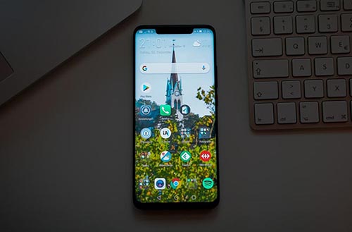
A responsive website adapts itself to the screen it’s being viewed on, so important when your visitors could be viewing it on a 27” flat screen, a 12.9” iPad, or a smartphone. If your current website was built recently, it’s likely your template or builder included a responsive design, but check if you aren’t sure.
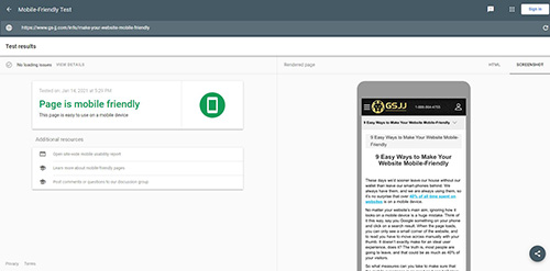
The simplest way to do this is simply to look at your website on your smartphone and/or tablet, but you can also use the Google Mobile-Friendly Test. This test will let you know if your site is easy to use on a smart-phone, as well as any loading issues.
If it is not responsive, then it’s time to update your site. The best way to do this will depend on your CMS (content management system) and your current website build. If you’re ready for a complete renovation, make sure you backup your files and install a new theme. For WordPress, you can choose a free theme or purchase one from a site like ThemeForest.net. How much you need to spend will depend on your needs and wants, but you can find good ones from about $16 – $60. If your site was custom-built, and you want another custom build or an upgrade, it’s time to reach out to a developer.
A non-responsive website will mean that your content will be compromised and your visitors’ experience severely compromised. Most people will leave and not come back.
2) Curate Your Responsive Website’s Content
Once you’ve got a responsive layout, it’s time to take a good look at what it looks like. Most website builders will have an option when designing to toggle between the different views: smartphone, tablet, and desktop. Open your website editor and take a look at how your website looks on a smartphone.
Many of these will allow you to omit certain sections when viewed on a smaller device. This can be a good idea if you have something like a video that plays automatically on a desktop but doesn’t look quite right or drastically slows the loading time when viewed on a smartphone. So take a look at the first pages your visitors are likely to land on and see how they look on each device.
3) Speed Matters
When you start simplifying your site for mobile, you’ll also likely see your loading times improve. Ideally, your site should load within about 4 seconds, less whenever possible. People’s attention spans are short, and often they simply want a quick answer.
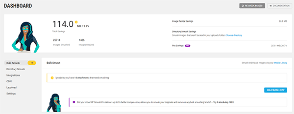
Similarly, compress any pictures so that they load as quickly as possible. You don’t need to do this manually; there are plugins that can do this for you on all platforms (such as Smush on WordPress).
4) Delay (or Ditch) Popups
This is a good idea generally, but on mobile, it’s more important. If you have a popup on your site that normally pops up within the first 1-5 seconds of a customer being on your site, delay it a little longer. When it pops up on the desktop, we find it easy to see some of the sites around the popup or exit out of it, but this is often difficult on mobile. If it’s too difficult, you’ll lose people. So make sure your popup is easily exited out of on mobile, and consider delaying it a little longer. That way, someone can decide if they’re in the right place before you hit them with an offer.
Alternatively, ditch the popup altogether if it’s hindering the experience.
5) Avoid Busy Layouts
A busy layout is the go-to in certain niches, but it’s best to choose something much more minimalistic for your mobile site. Make sure you don’t have ads sliding in from all over the place, avoid cursive fonts that may be too small to read easily, and make sure the text and background colors are easy to read. For text, a good test is to load the website on your phone and see if you can read it while strolling down the street. If you can, then your text is likely the perfect size and color.
6) Get Rid of Flash
Flash is old and outdated and won’t work on most mobile devices (in fact, you’ll have trouble finding one that does). If your site is relatively recent, it’s unlikely that it has Flash, but if it does, it’s time to upgrade your website.
7) Keep it Tappable
Make sure all the buttons are big enough to click on for a thumb. Don’t crowd buttons or links together. People don’t want to be led somewhere they didn’t want to go, so give them a chance of touching the button or link they meant. If a viewer has to use a finger and thumb to expand their view, then that’s the website designer’s fault and shouldn’t happen. Also, consider your audience – what age are they? If your audience or target customer is in an older generation, consider sizing everything up a little more.
8) Stick to One Core CTA
If you have a service-based business and not a store with several different products to browse, make your CTA (call-to-action) as clear as possible. If you’re a plumber, make your core CTA a clickable phone number so they can get in contact with you quickly. If you want them to register for a call-back or to schedule a demo, make sure that’s clear and easy to do, too.
9) Test, Test, Test
However you or your designer build a website, there is only one way to know if it has been optimized for mobile devices – physically check. You must not assume that everything works on all devices; you have to test if that is true. Test on various mobile devices at each stage of the design process and encourage friends, family, and employees to do the same. It is very easy to miss something. There are bound to be anomalies, but they can’t be addressed if you are not aware of them.
Constant testing needs to carry on even after the site is live. The technology of hardware and software is changing all the time; what works today may not tomorrow. Don’t assume everything is okay, test. There is a new iteration of every mobile phone each year, operating systems are constantly upgrading, and the only way to stay on top of the situation is by constantly checking and evaluating.
These nine tips will help ensure that your website is as compelling on a mobile device as it is on a computer. You may experience the odd hic-cup when optimizing a website for the myriad of devices available to the consumer, so backup your files and reach out to a designer or developer if you’re struggling.
Mobile devices are not going away anytime soon, and if you want your internet presence to provide your visitors with a memorable experience, make sure your mobile experience is just as good as the experience your desktop website offers.


 USD
USD EUR
EUR GBP
GBP CAD
CAD AUD
AUD NZD
NZD


 STAFF PICKS
 Products In-Stock
  Video Collections

